Unlocking Colorblind Friendly Game Design
For those of you who read my Puzzle Game Reviews blog, you may have noticed that I try to call out if a game is colorblind-friendly or not. When a game isn’t, I also like to indicate in the review how well it can be worked around. As someone with colorblindness, this is very important to me and, I hope, is helpful for fellow colorblind gamers. As I continue to run into games that aren’t colorblind friendly, I thought it might be helpful to write a guide for creating colorblind-accessible games. This article is primarily geared towards board games, puzzles games, escape rooms and similar games, though I’ve included a few links at the bottom, under additional resources, that are germane to video game and UX design.
A Primer on Colorblindness
Before getting into how colorblindness relates to game design, it’s important to define what, exactly, colorblindness is and how common it is among the population. There’s a common misconception that colorblind people can’t see color at all and that they see the world completely in shades of grey, like a black and white movie. While that type of colorblindness, known as achromatopsia or monochromancy, does exist, it’s excessively rare, affecting around 1:50,000 people1https://www.color-blindness.com/2007/07/20/monochromacy-complete-color-blindness/. Far more common are types of colorblindness that affect the ability to distinguish between red and green, known as deuteranopia (green-blindness) or protanopia (red-blindness), which affect approximately 1 in 12 people with a Y chromosome and 1 in 200 people with two X chromosomes2https://www.ncbi.nlm.nih.gov/pmc/articles/PMC6150100/. Less common is blue-yellow colorblindness, also known as tritanopia, which affects about 1 in 100 people3https://www.color-blindness.com/tritanopia-blue-yellow-color-blindness/. Altogether about 5% of the population has some form of colorblindness, with 99% of those people having a red-green deficiency.
Another thing that people don’t often realize, is that colorblindness can fall on a spectrum. So, to use green-blindness as an example, if you’re only partially colorblind to green, you’d have what is known at deuteranomaly. If you have complete green-blindness, you’d have what is known as deuteranopia. So, even among colorblind people, there can be fairly different perceptions of what colors look like. (Quick aside: If you’ve seen those viral videos of people seeing colors for the first time with those special glasses, those people have either deuteranomaly or protanomaly; they don’t work on people with deuteranopia or protanopia.)
If you’ve lived your entire life being able to see color normally, it can be hard to imagine what the world might look to someone with color-impaired vision. So with that in mind, here is a fantastic representation of what colors look like to people that are suffering from one of the thee major colorblindness types:
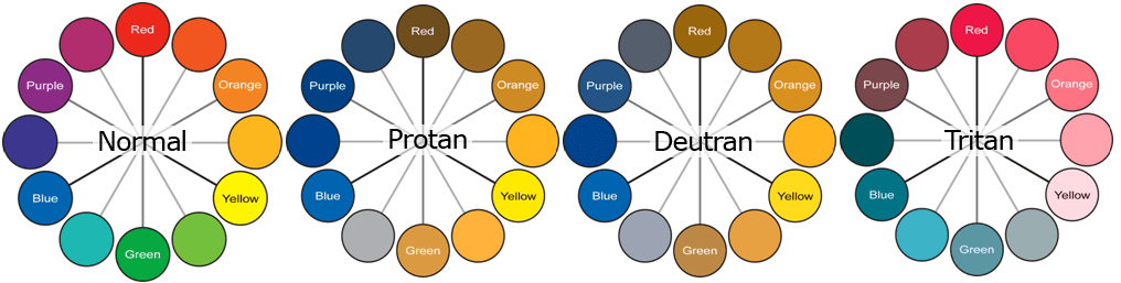
As you can see, the colors vary wildly based on colorblindness type; even affecting colors outside of the primary color deficiency. Using deuteranopia, the most common type, as an example: red and green have become brown and tan and purple has become blue!
So with that high-level understanding under our belt, let’s tie it back into game design. Color is an invaluable element in game design; it’s used to help delineate teams, help players quickly determine game state, as components in puzzles, and a myriad of other uses. Being able to understand the colors used in a game is often critical to being able to play the game, making some games effectively unplayable if you can’t distinguish the colors being used in them. So, when game designers don’t take into account how the colors they’re using could impact their game for colorblind players, they are potentially alienating 5% or more of their potential game audience. Sure that’s not an astronomical amount, but would you voluntarily take a 5% decrease in potential game sales if you didn’t have to?
Theory is good, but pictures are worth a thousand words. So let’s look at a few examples from some real world games that I love, but whose design choices have caused issues for me when playing them:
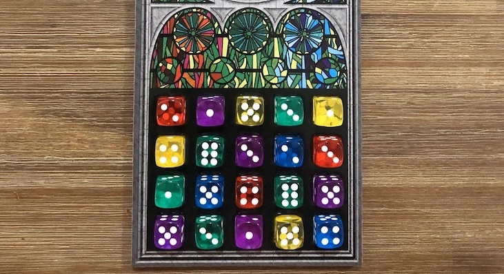
This is a picture from a game of Sagrada, an otherwise delightful dice-drafting game. The game is played with five colors of dice: red, green, blue, purple, and yellow. I’m a deuteranope, so you might think that the red and green dice would be the issue for me, but surprisingly, in this case, it wasn’t. Here’s what that same picture looks like with simulated deuteranopia:
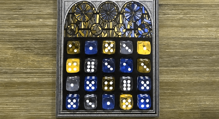
The dice in this game are translucent, evoking stained-glass, and the colors shift slightly depending on the temperature of the lighting in the room you’re playing in. In the warm lighting inside my house, I am able to distinguish the red and green dice from each other, they’re distinct enough shades that it doesn’t cause an issue. The blue and purple dice, though? Forget about it, they might as well be the same dice. When playing the game unmodified, someone other than me has to separate the dice and explicitly point out their colors to me when we play. It slows the game down and it’s just kind of a bummer to be reminded every turn that I can’t see the same colors that everyone else is seeing.
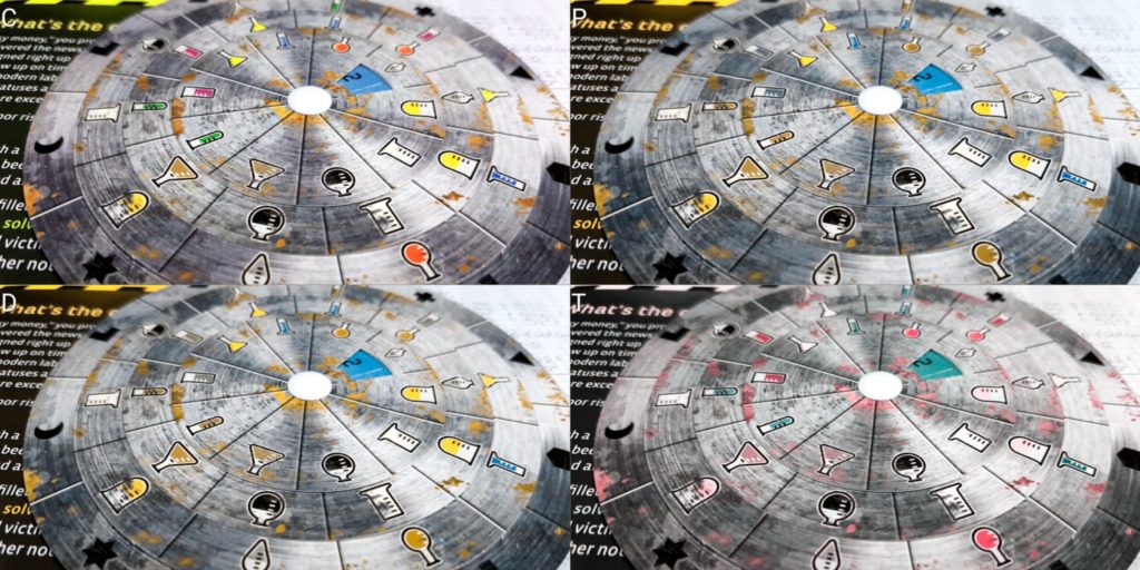
Here’s another example, the otherwise excellent Exit: The Game series. I’m a huge fan of this series and during quarantine, purchased and played all 18 of their released English language games. Their core game mechanic is a decoder wheel that requires you to find and enter a three digit combination to solve the puzzles. In many of their games, each number will be assigned a color and then require you to figure out the right colors—and thus the right numbers—to enter on the disks. With ten possible digits, each needing a unique color to be assigned to them, it would have required specifically considering colorblind-accessible shades in order to avoid using colors that are indistinguishable to colorblind folks. This is what the decoder disk from their first game, The Abandoned Cabin, looked like:
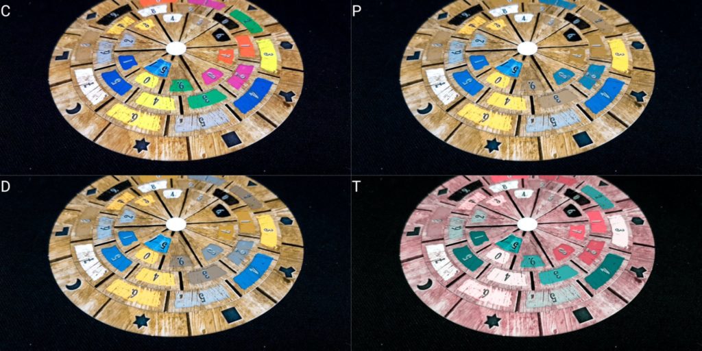
Whenever I run into one of these puzzles in the game, I’m required to stop the game (and the game timer), go find my partner, interrupt whatever she is up to, and have her point out to me which elements on the page are which colors, while I dutifully markup the pages and the number wheel with shorthand notes. If she’s not around, then I either have to put the game on hold until she’s back or bypass the puzzle by using the solution card. It’s not a great game experience and can be pretty frustrating.
Designing Games With Color Accessibility
So, how can you design your game to avoid issues with colorblind players? There are a number of strategies and techniques you can employ to ensure the game can be as enjoyed by as many people as possible, without necessarily increasing the cost or complexity of the game design and publication.
The most important question to ask yourself is “What are the colors being used for in this game?” If the colors are being used to convey critical game-state information, are the key to solving a puzzle, or are otherwise necessary for playing the game, then you should be considering the impact that not being able to see the colors correctly will have on your players.
When selecting colors for your game, you want to make sure to avoid color pairings that would be ambiguous to colorblind gamers—especially colors that are conveying important game information, like puzzle components, player or faction identifiers, or game piece colors. If you’re unsure if the colors you’ve selected are colorblind safe or not, there are tools that can simulate colorblind vision or generate color safe palettes, I’ve included a selection of them at the bottom of this post.
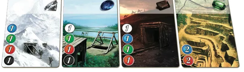
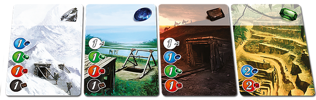
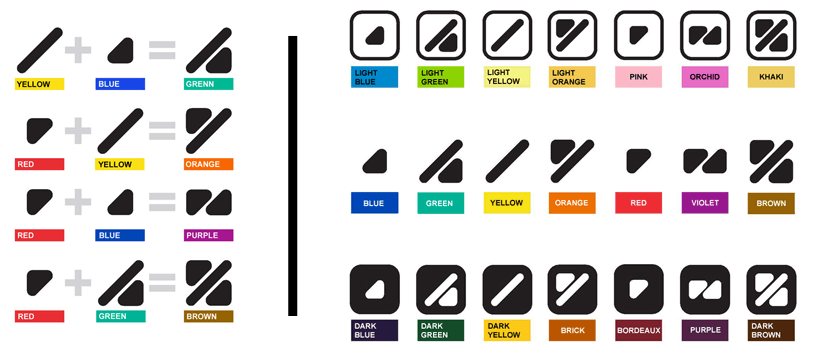
A common concern among designers is that they won’t be able to accommodate colorblind games while maintaining their desired game aesthetic. Fortunately, that’s not the case and there are actually plenty of colors available that you can use that will be accessible to all players. As a rad example, check out this palette of colors, created by two colorblind medical researchers, that are unambiguous to people with the three most common types of colorblindness:
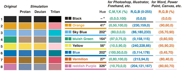
If you’re looking for colors to use for components in a game, there’s eight right there (nine, if you include white)—plenty to choose from that are both accessible and can fit in your particular game design vision. Just the act of selecting accommodating color pairings can go a long way towards better accessibility, but that’s not all you should consider when making your game.
If your game is using colors to convey important game information, you shouldn’t force the colors to do all of that heavy lifting on their own. Instead, pair them with some sort of pattern, texture, or icon to help distinguish them from each other. It doesn’t have to be anything complicated, just some sort of marker that makes the information the colors are trying to convey unambiguous to anyone looking at them.
To go back to the Sagrada example from earlier, the game in its default state was practically unplayable to me without outside assistance, as knowing the color of each die is critical to being able to play the game, and two of the dice were indistinguishable. However, the dice shouldn’t be relying on their color alone to convey that information. Thankfully, I was able to easily modify them to make the game accessible to me; by using a gold sharpie, I was able to change the pips on the purple dice into something that made the dice distinguishable to me at a glance:
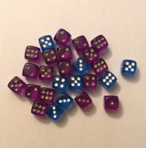
Note, the dice are still purple, but that is no longer the sole method of communicating their color to me; the die pips act as a secondary communication method, while maintaining the translucent stained glass aesthetic the game designers wanted. Ideally, the folks over at Floodgate Games would have put different colored pips on the blue die (to help prevent confusion with the purple die for deuteranopes and confusion with the yellow die for tritanopes) and the green die. The dice could still be translucent, giving it the stained glass aesthetic they were looking for, while still being accessible to more gamers. (To be fair to Floodgate Games, they are now looking into making their game more accessible.)
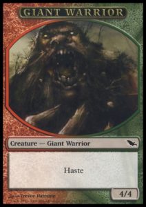
Adding textures to your game’s colors doesn’t have to be arbitrary slashes or polka-dots; you can add textures that enhance the flavor and reinforce the theme of your colors. Take, for example, Magic: The Gathering; the five-color color wheel is the foundation of the game and includes both red and green as colors. Wizards of the Coast does a few things to help ensure that this is never confusing to colorblind players. First, the mana symbols have distinctive shapes in addition to their colors. The red mana symbol is shaped like a ball of fire and the green mana symbol is shaped like a tree, immediately evoking the themes of the colors. Second, to help ensure that cards of separate colors aren’t confused with each other, they use textured backgrounds on the colored card frames that communicate the card’s color identity. Take a look at the Giant Warrior card on the right, a card that is both a red-aligned and a green-aligned creature. The red side of the frame’s background has an abstract fire texture to it, while the green side of the frame’s background has an abstract plant background. They don’t pull focus away from the important parts of the card, but instead provides a subtle textural flavor to the colors, while simultaneously removing ambiguity from the colors of the card.
Another quick example, from another one of my favorite board games. Splendor is a game that uses the same colors as Magic: The Gathering. Taking a cue from Magic the Gathering, they gave each color’s gem a different recognizable shape, making the game pieces easily distinguishable:

However, in the first edition of the game, they printed the resource costs—on the bottom left—of the cards you purchase like this:
The costs tell you how many of each resource you need to purchase the card. On cards that had both green and red symbols, it wasn’t as much of a problem, because they were always in the same order: White, Blue, Green, Red, Black. So if a colorblind gamer sees red and green on the same card, they can say “Ah, top one is green, bottom one is red, no big deal.” However, take a look at the the card furthest to the right above. Its cost is blue and a color that I can’t immediately identify one way or the other. I’ve included a simulated version of the card to the right. If you have normal color vision, what color do you think the bottom color is?
Thankfully, for Splendor, there was an easy fix that they could make in the second printing of the game that made it far more accessible, without sacrificing theme:
By adding the gems to the color costs, they have removed any potential ambiguity of what color each cost requires. The colors are still there, they’re just no longer solely responsible for conveying the information that the players require. It’s a simple and elegant solution. Even at this lower resolution size, it’s obvious that the card on the far right requires blue and red for its cost.
Finally, one last example of a game that offers superb colorblind accessibility, Scythe:
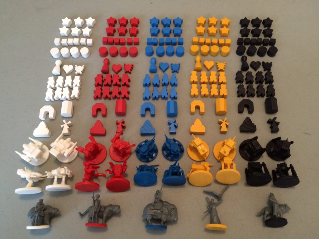
Each faction is represented by a different color. However, they take a couple of great steps to make sure the game is very accessible. First, they use five colors that are unambiguous and distinct, even if you have one of the three most common types of colorblindness:

Second, they give each faction’s game pieces a unique shape and silhouette, helping make the game accessible to monochromats and aiding in unit faction recognition on the game board, even at a distance. The game’s resources also use a similar palette and each are a distinctive shape, there’s no ambiguity about who has what. It’s clear that the game designers were able to prioritize accessibility without compromising on their distinctive vision for the game aesthetics.
What About Puzzles?
Creating a diverse variety of puzzles for a game can be challenging, and color can seem like a natural property to create puzzles around. So with that in mind, here is some general advice for creating puzzles with color that are still accessible to people with colorblindness.
The first thing to note is that color puzzles can still exist that are fun and challenging for the non-colorblind and colorblind alike. Remember that Exit: The Game decoder disk I showed earlier? In a later game they had a much more accessible color puzzle system, that looked like this:
While each beaker contains a different color, the beakers are all unique shapes, giving a secondary means of identity outside of color. It’s still thematic and fun, just more accessible.
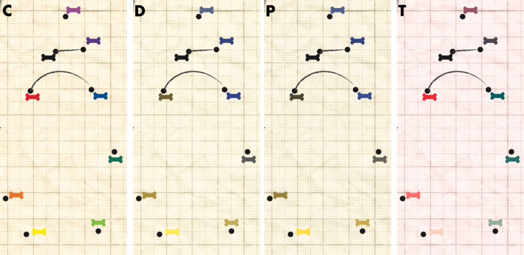
Here’s a non-exhaustive lost of some common color puzzle types that, without secondary indicators, will pose an issue to colorblind players: sorting colors into a specific order, mixing colors, requiring the identification of a color name (e.g. for indexing puzzles), stroop effect puzzles, and puzzles that involve matching colors between separate elements with abstract shapes. As a quick example, this was part of a puzzle used in an at-home puzzle game I played recently that featured color-ordering. Check out how to intended sequence can vary or be muddled by colorblindness:
There are some really cool tools out there if you are looking to create accessible color puzzles in your game. One of them, that would be perfect for making an accessible color mixing puzzle, is the ColorADD color identification system. ColorADD is a free icon system that identifies color and intuitively supports color mixing. Check it out:
If these symbols look familiar, it might be because Uno used them when it developed a colorblind accessible version of its game. The iconography is simple and easy to understand, yet also lends itself to potential puzzle applications. I would love to play a game that found a clever way to use these symbols in a puzzling way.
Playtesting Includes Colortesting
While it’s important to consider color accessibility when designing the game, it’s equally important to check for colorblind accessibility issues during the playtesting process. Unless you’re colorblind yourself, you won’t really know if there are any color issues in your game until you have colorblind people play the game. The best time for that to happen is during playtesting, when it’s still easy to make changes to the game. For smaller playtests, you may need to deliberately solicit colorblind gamers. It also helps to know what kind of colorblindness they have, as a person with deuteranomaly and a person with deuteranopia could have very different experiences with the colors in your game. When receiving feedback, make a point of specifically asking if they had any color-related issues, as they are used to having issues in everyday life.
Almost any color accessibility issue can be worked around or fixed. However, if you find yourself in a position where you’re unable to fix it, such as in the case of a game that has already been released, give players a preemptive heads up of the issue. You can also use this as an opportunity to inform players of any workarounds or, in the case of a puzzle-type game, which puzzle in particular has the issue, in-case they need to skip it or bring in a second set of eyes.
Additional Resources
- Meeple Like Us: Site that offers extensive accessibilty reviews for board games.
- Colorblind Games: Reviews boardgames for colorblind accessibility and suggests modifications to make them playable.
- ColorADD: Color Identification System that has created a set of standard symbols to identify colors.
- Can I Play That?: Site that offer accessibility recommendations and news for video games
- Colorblinding: Colorblind filter plugin for Google Chrome to simulate colorblindness on webpages
- HCL Wizard: Site that helps you generate accessible color palettes and simulate different types and degrees of colorblindness on uploaded images.
- Chromatic Vision Simulator (iOS / Android): Smartphone App that simulates colorblind vision using the device’s built-in camera
- Photoshop: Features colorblind accessibility filters, as detailed here: https://www.adobe.com/accessibility/products/photoshop.html


One Comment
Tom
Chris, what a fantastic article. I’m in the process of setting up a theatre company and this has been invaluable to my understanding of inclusivity when it comes to colourblindess. Thank you for taking the time to write this.